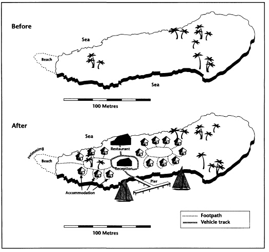
题目内容
(请给出正确答案)
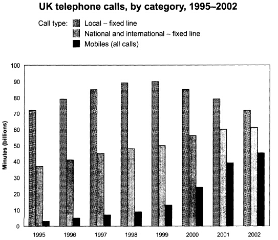
题目内容
(请给出正确答案)
[主观题]
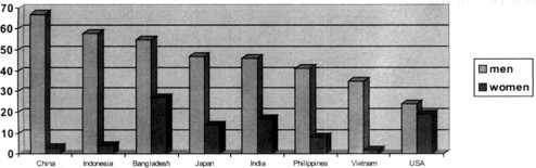
The bar chart shows the percentage of people who smoked in eight countries in 2005. Summar
The bar chart shows the percentage of people who smoked in eight countries in 2005.
Summarise the information by selecting and reporting the main features and by making comparisons where relevant.
Write at least 150 words.
 如搜索结果不匹配,请 联系老师 获取答案


.jpg)